Exhibition & Gallery Visits
GUCCI COSMOS
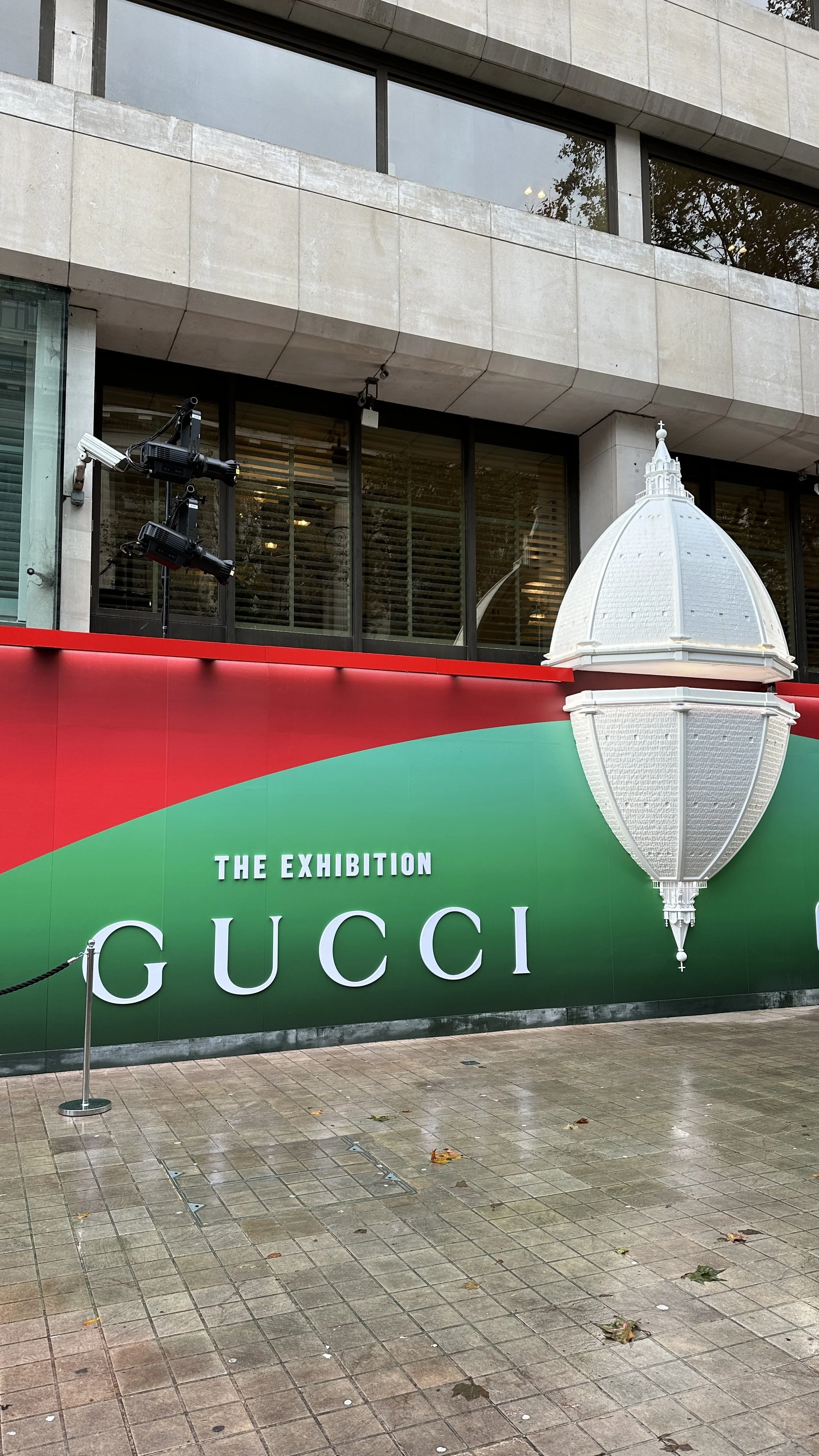
During the course of Unit 02 on Defining Design for Art Direction, I came across the GUCCI COSMOS exhibition by chance, presenting Italian fashion house Gucci’s travelling archival establishments through an immersive exploration of its history and ‘era-defining’ creativity. The exhibition aims to portray how Gucci has and continues to not only mirror the times, but also define them. With contemporary artist Es Devlin responsible for its concept design, the exhibition reaches another level of creativity and engagement through its unique installation and curating methods.
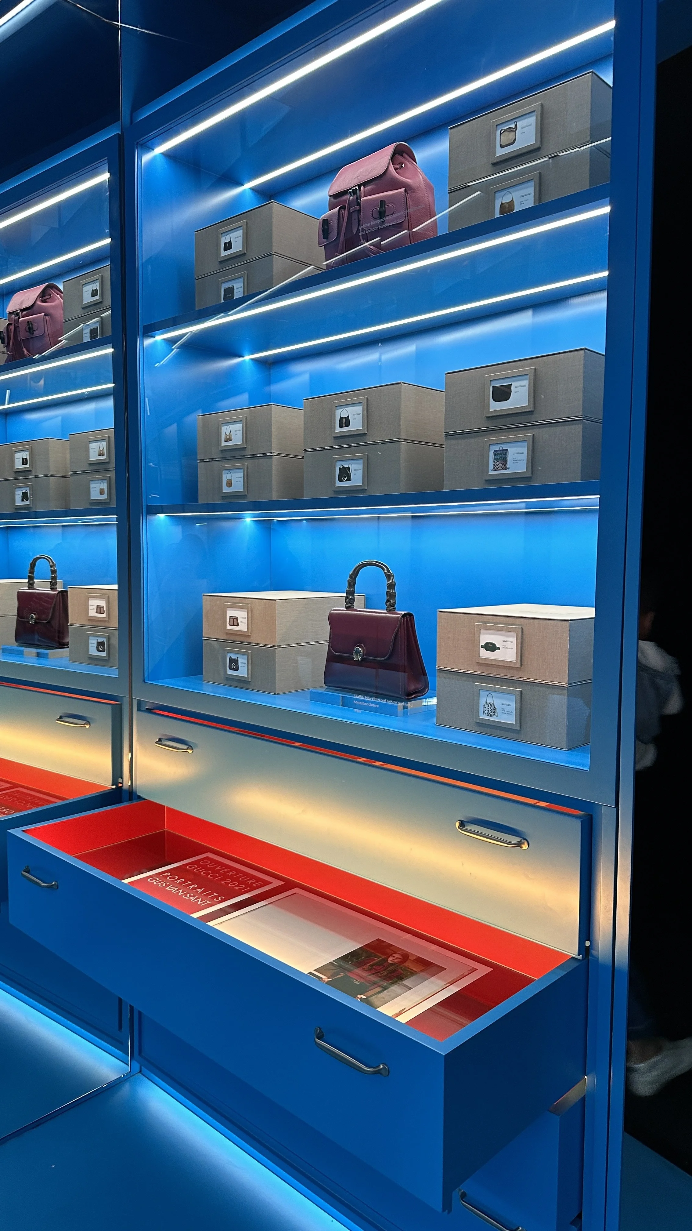
Two of my favourite ‘worlds’ in this exhibition includes the ‘Archivio’ and the ‘Cabinet of Wonders’. At ‘Archivio’, we see a series of designed bags displayed in cupboards, while audiences are allowed to open the drawers for more information about the bags displaced (editorial shoots, design concepts, etc.). This interactive method not only makes it more amusing for us to explore, it also creates meaning as if we are actually looking through the brand’s history; searching for archival information regarding Gucci’s designed bags across different times.
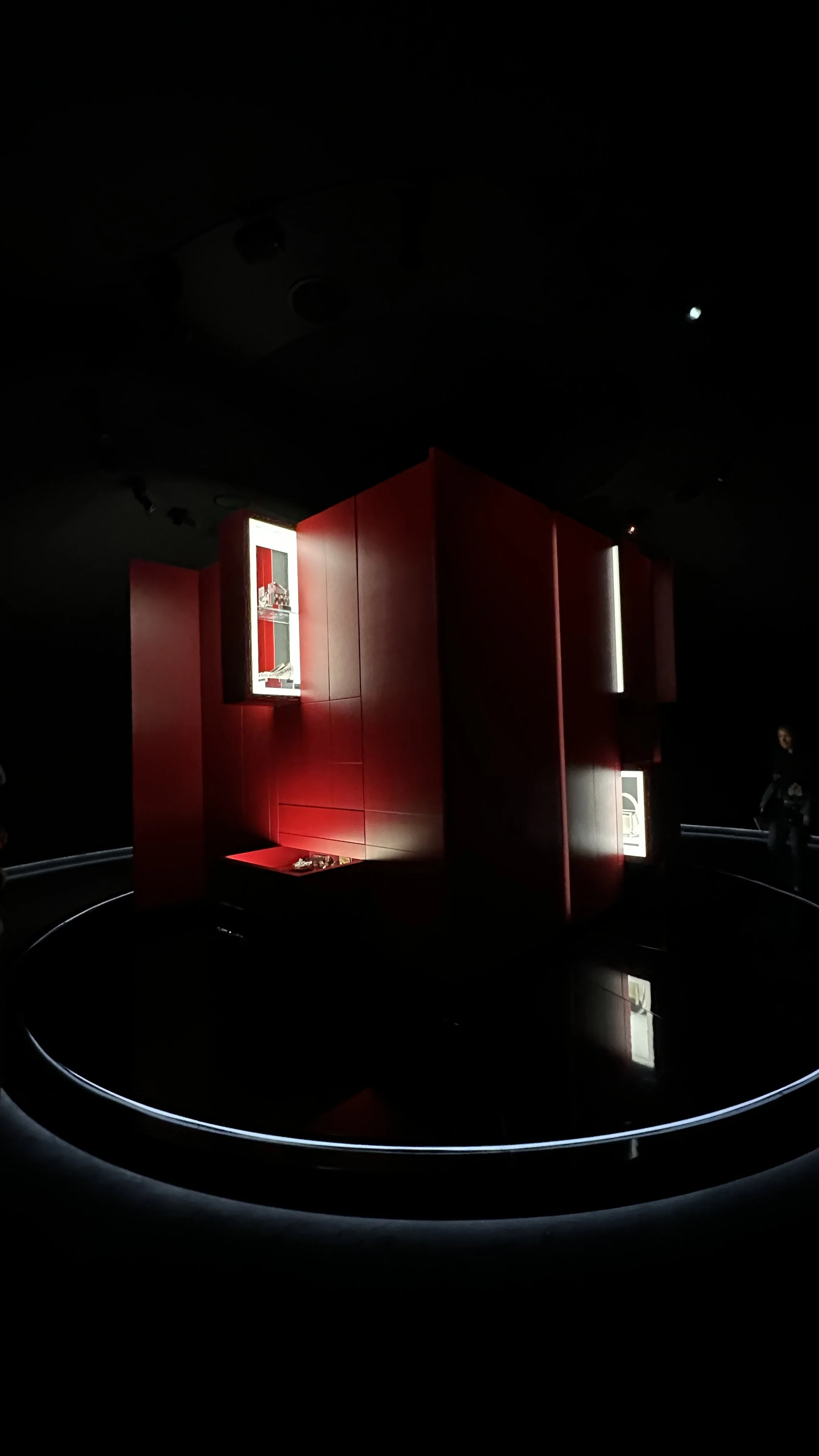
On the other hand, 'Cabinet of Wonders’ displays a moving installation in the form of a cube, where cabinets slide out automatically on different sides depending on the different time periods the designs were reflective of. By presenting this in a dark atmosphere, the implanted LED lights surrounding the products made each collection seem more ‘treasurable’, adding value and importance to each of these designs.
The exhibition holds together different levels of meaning through a series of visualised ‘worlds’ in different rooms representing the brand’s past (unfolding Gucci’s history and ideals), its present, and its vision ready to be reactivated in the imminently defined future. It was mesmerising how the location of this exhibition at The Savoy- a historic hotel where founder Guccio Gucci first came up with ideas for his brand itself, adds meaning to the overall storytelling of this exhibit.

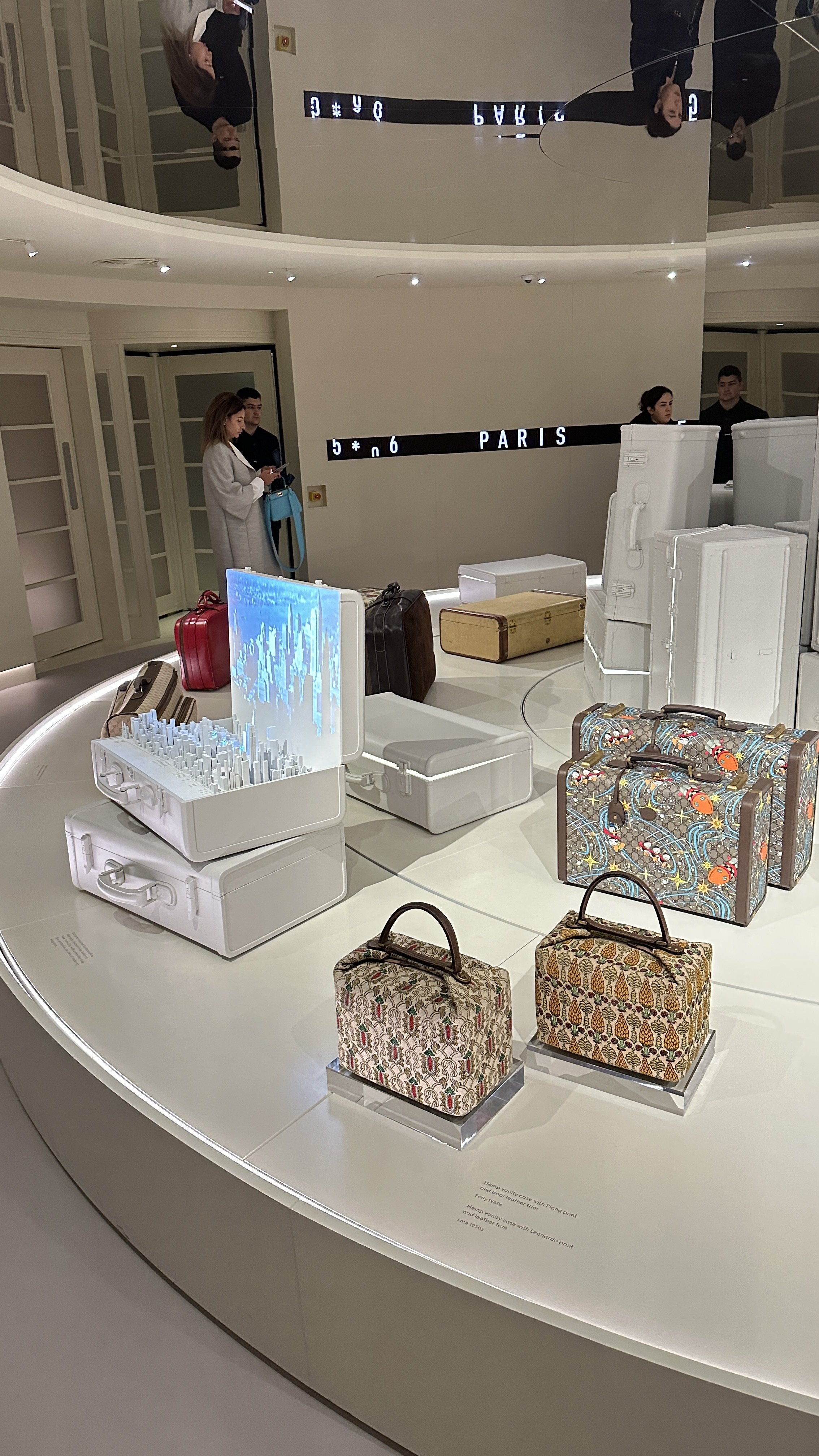

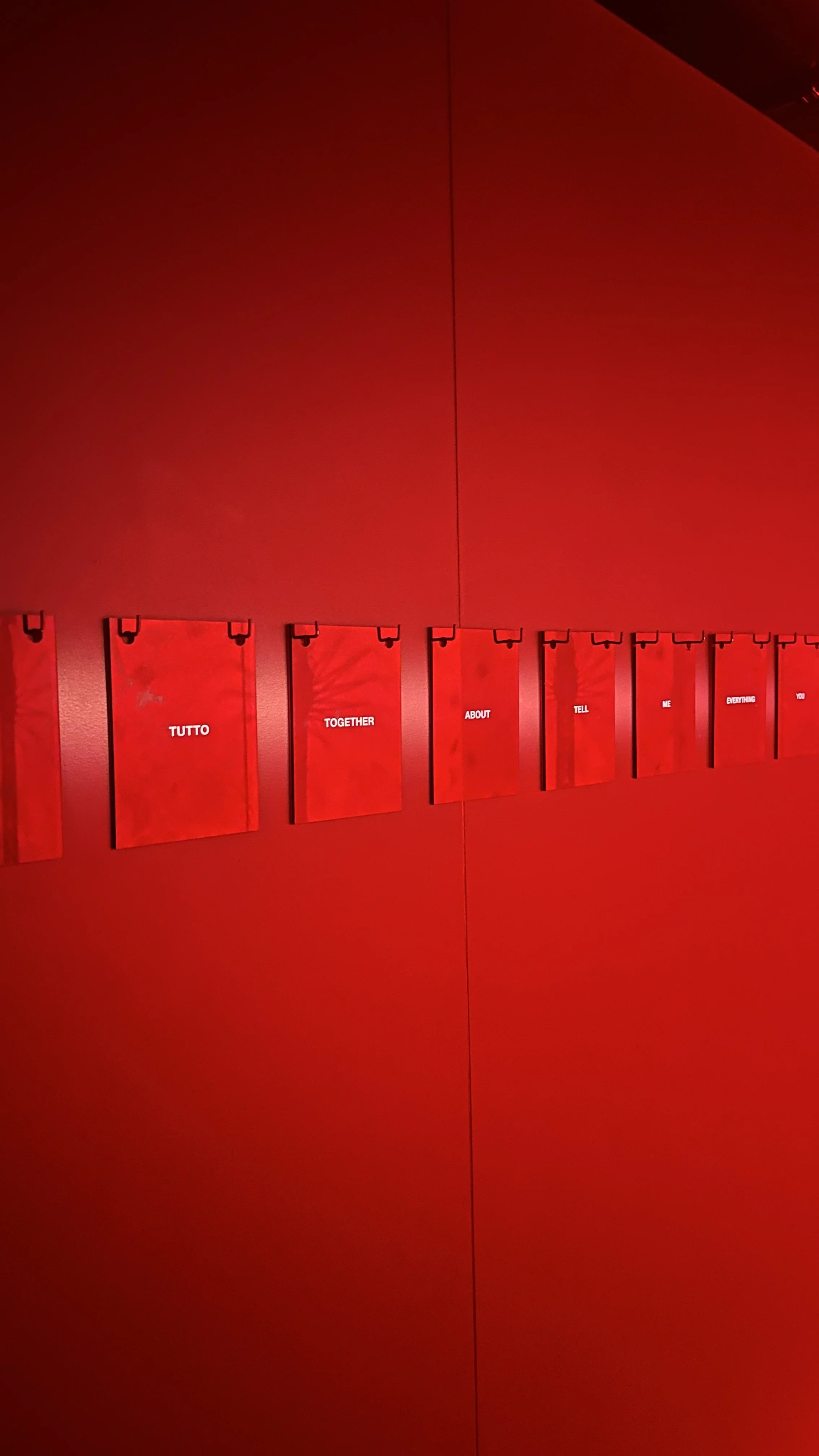
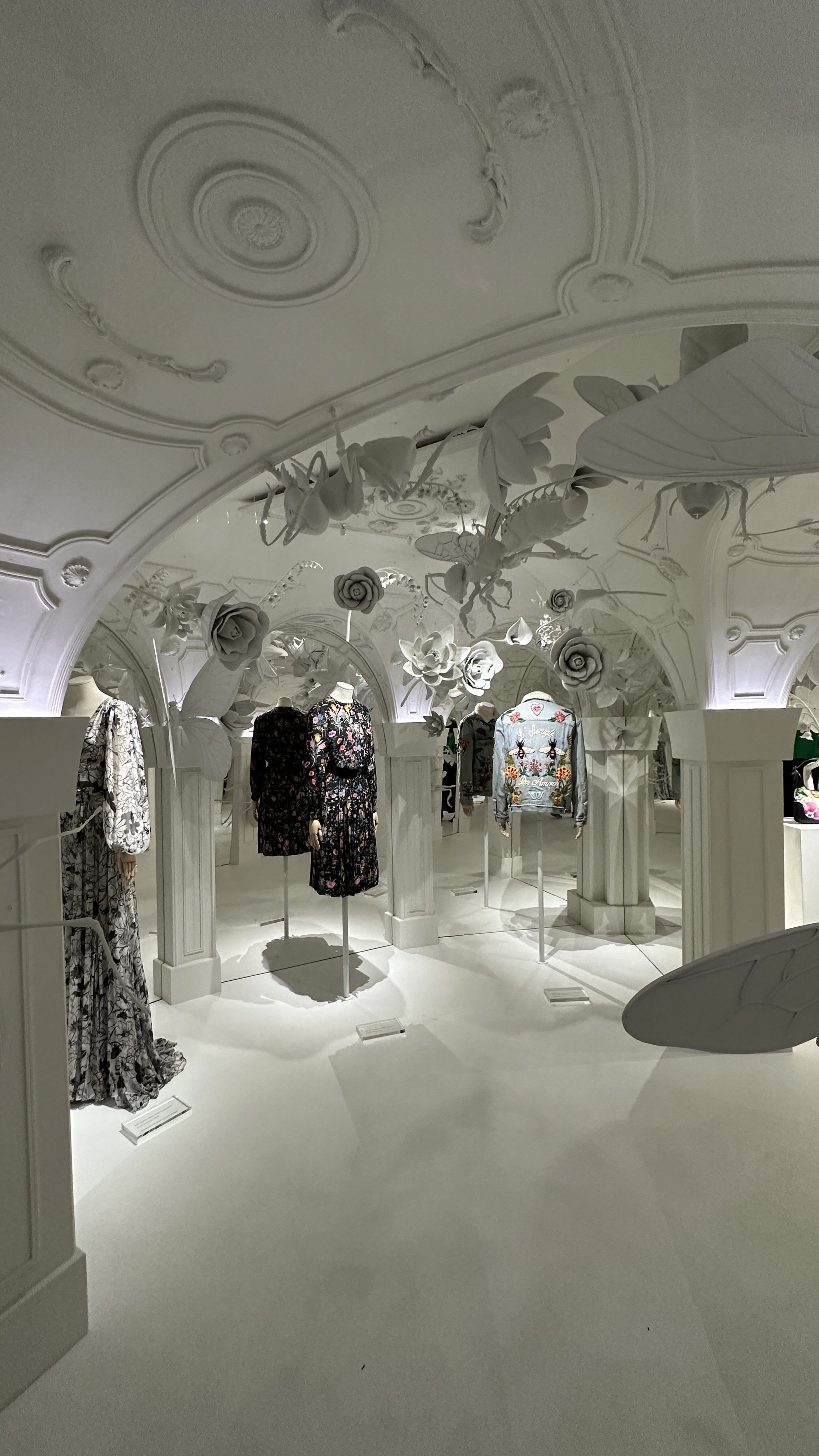

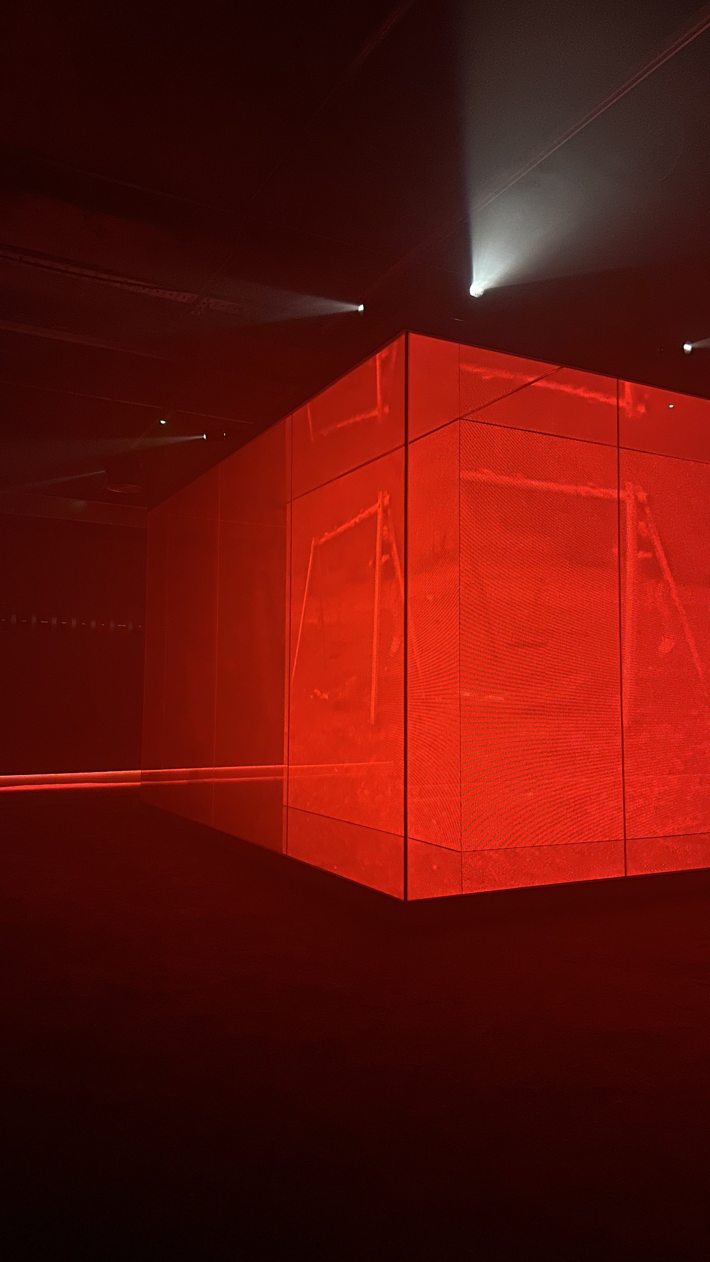
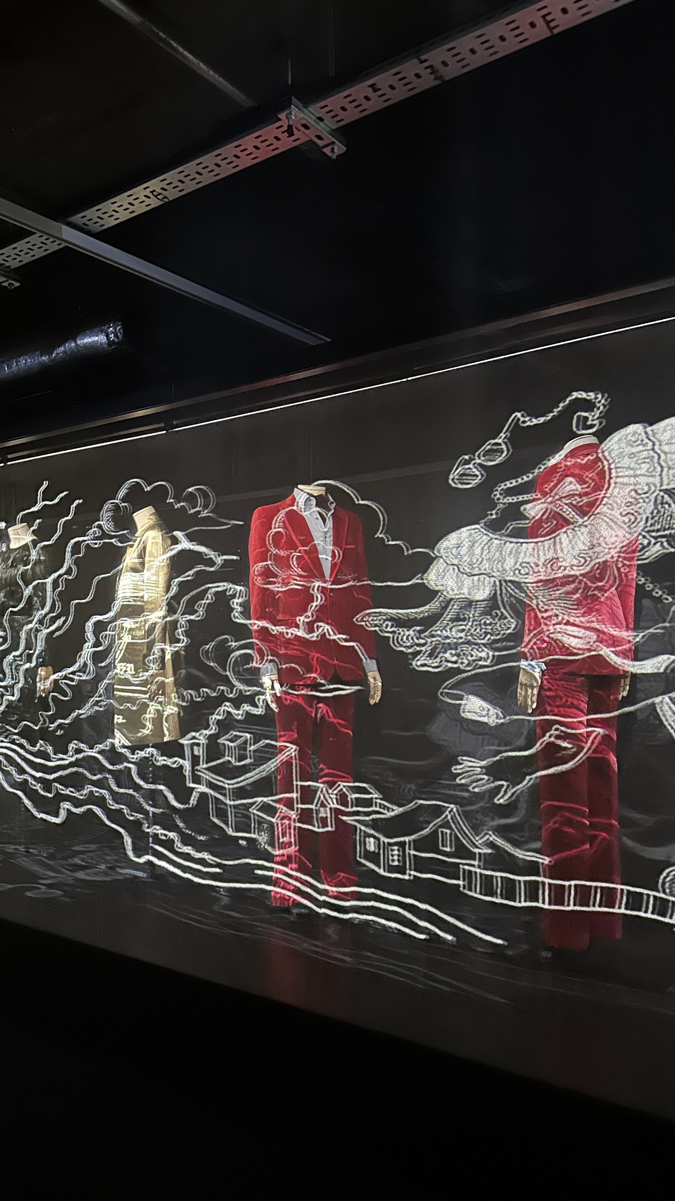

This captivating experience has really made me rethink what it means to be an art director. My initial thoughts after this visit is to become someone who could create work similarly inspirational and successful in capturing essences of not only its products, but the history, the founder’s passion, and all efforts put into building and shaping Gucci. Each design of these rooms hold its own symbol, but yet manages to categorise themselves into the three main groups of presenting the past, present and future through varied presentation mediums- such as archival imitations representing the past and digital screen projections representing futuristic features, to tell the whole story about Gucci in a way that involves the audience as well. Overall, I would conclude the curation and design by Es Devlin as the exact definition of what art direction is. Not only does it capture what the brand wants to communicate with its audience about, it even made me, as someone not familiar with the brand, feel attached to its world.
Other Galleries
-
Endless Variations
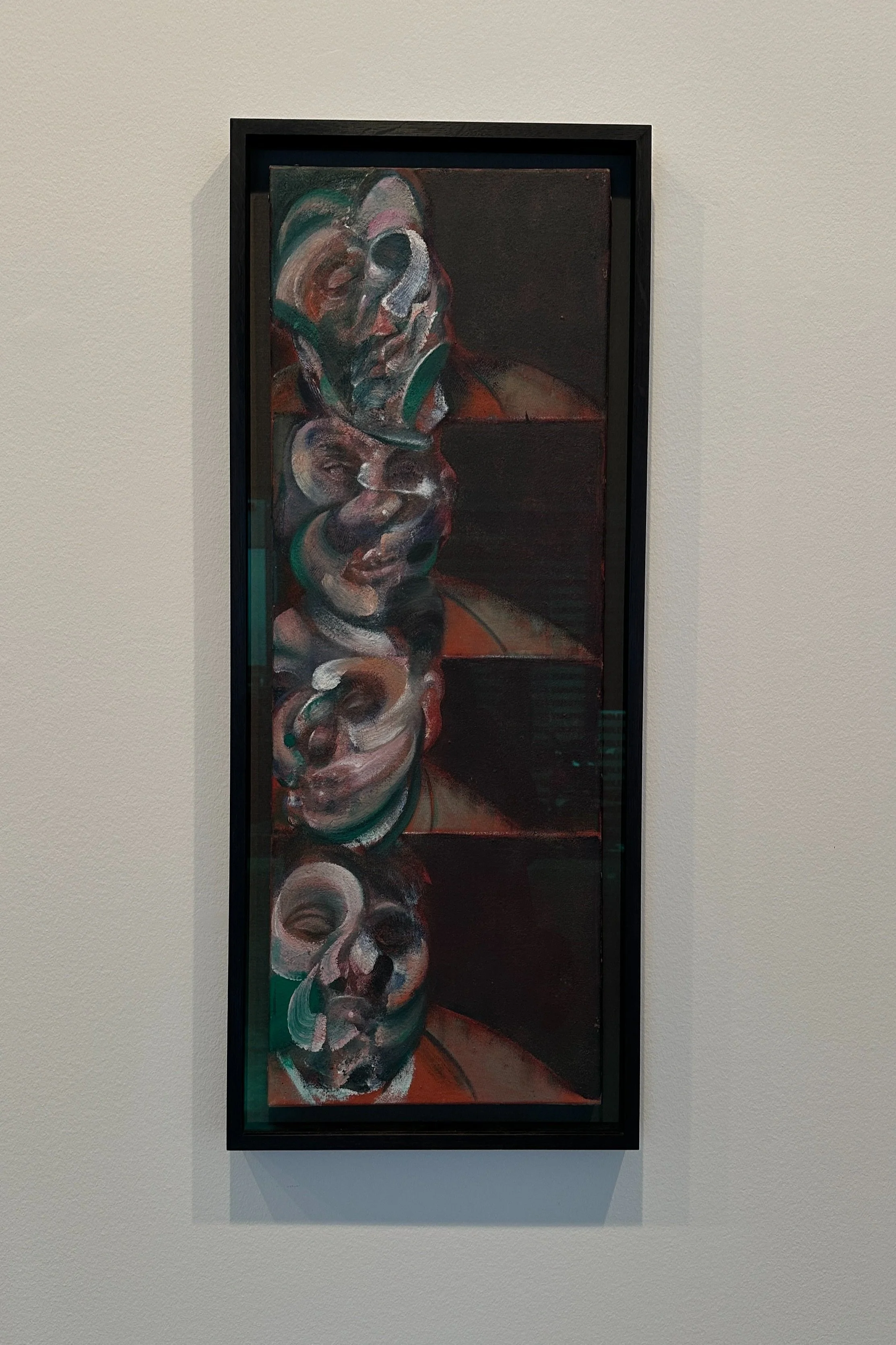
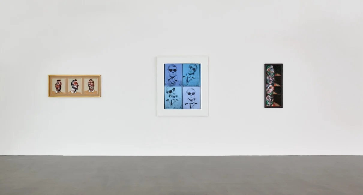
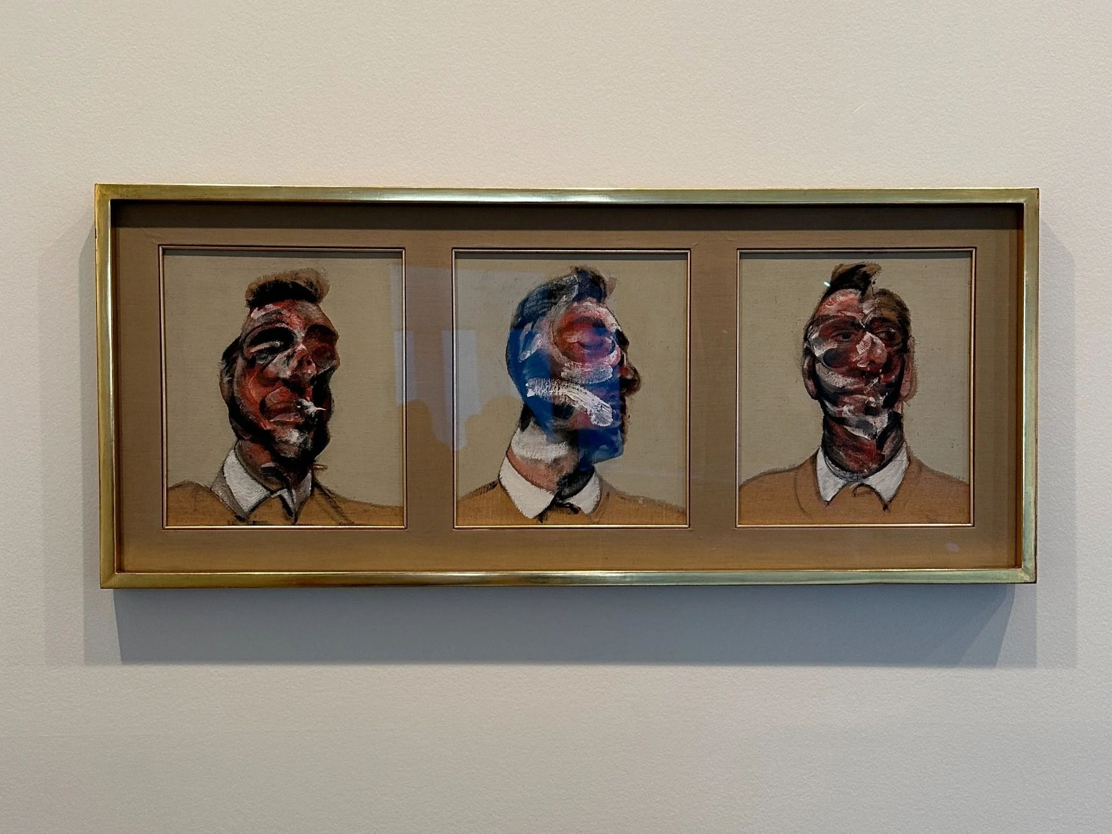
An exhibition dedicated to the work of two of the most important artists of the twentieth century: Francis Bacon and Andy Warhol. It explores common interests and influences shared by the artists- each central to defining the art of their own generation. Both artists’ use of media and visual representation demonstrates strong nuances to what they are each trying to express.
-

ON FOOT by JW Anderson
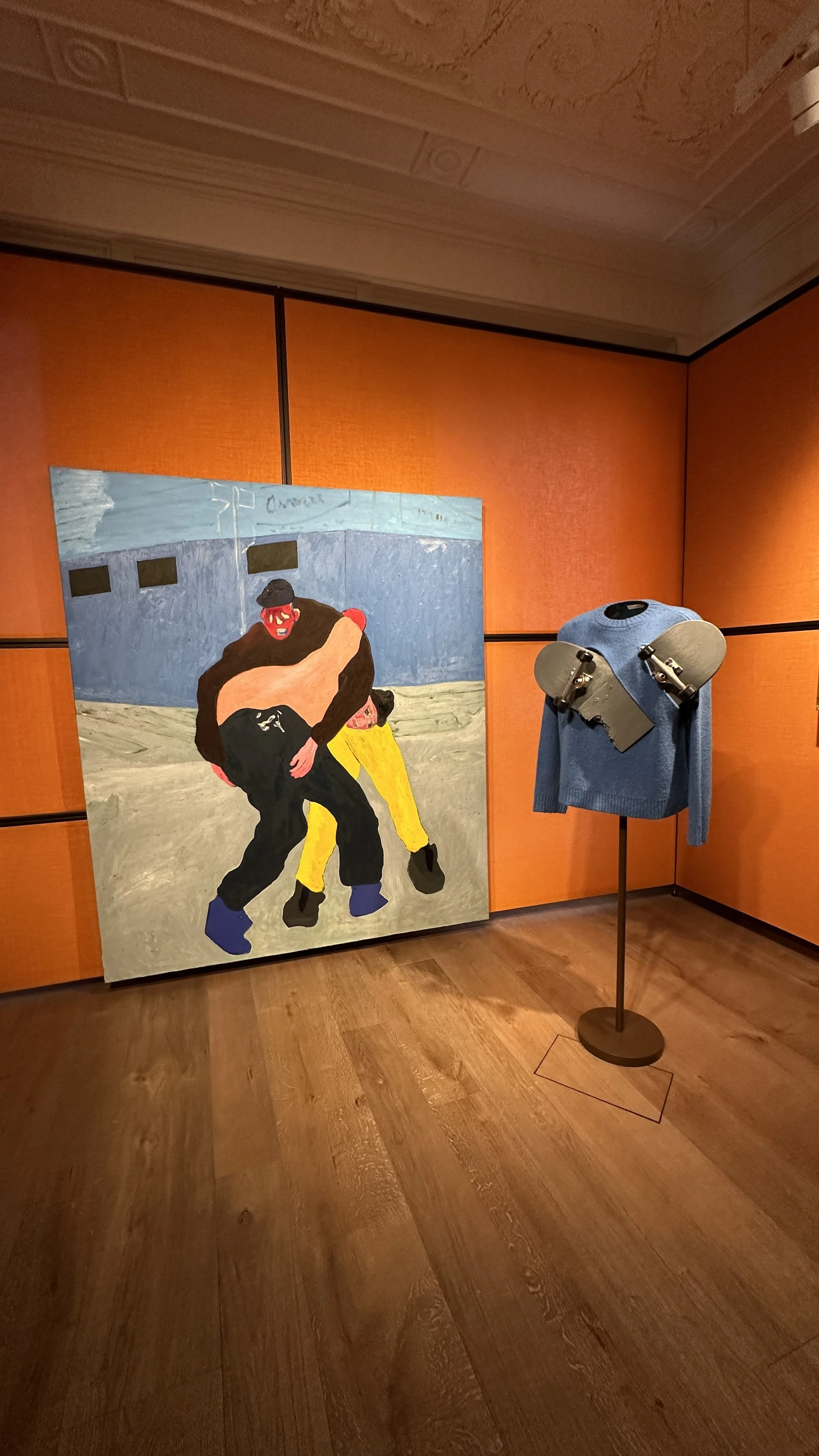
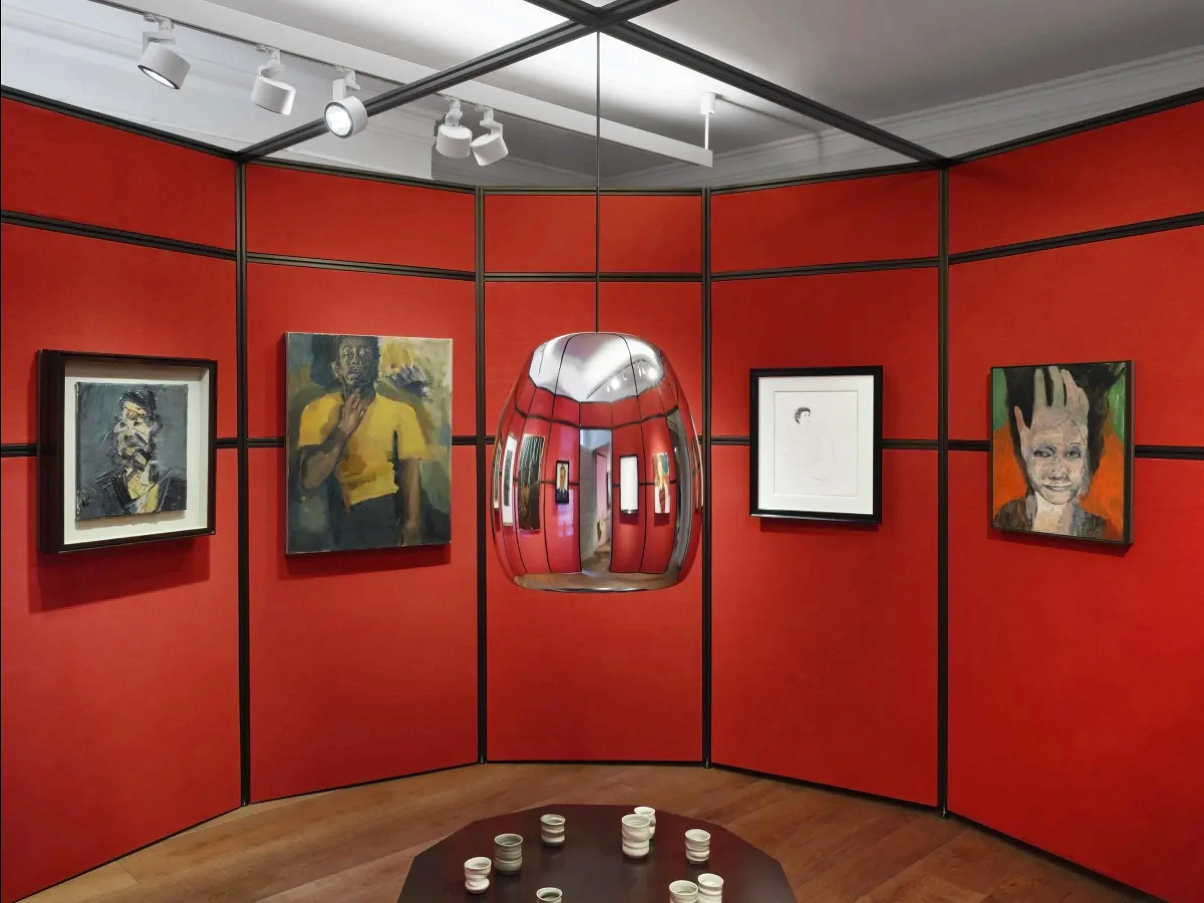
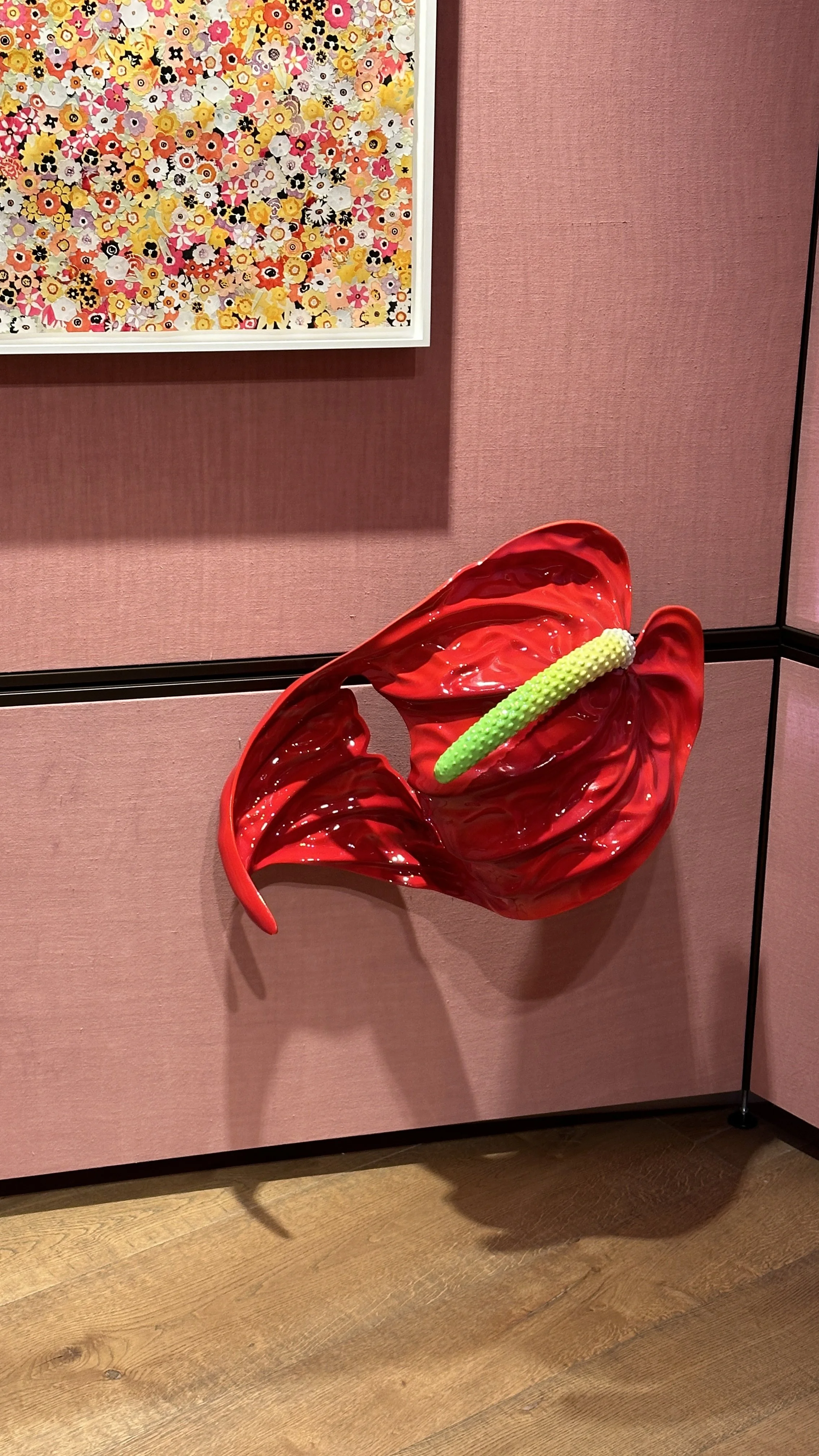
On Foot is an exhibition curated by Jonathan Anderson that imagines a walk across London. For Anderson, the city is an infinite source of inspiration, an “ever-changing palette” of people, architecture, temporalities and encounters. The exhibition reflects this diversity through aspects of the urban landscape demonstrated through its use of space & framing.
-

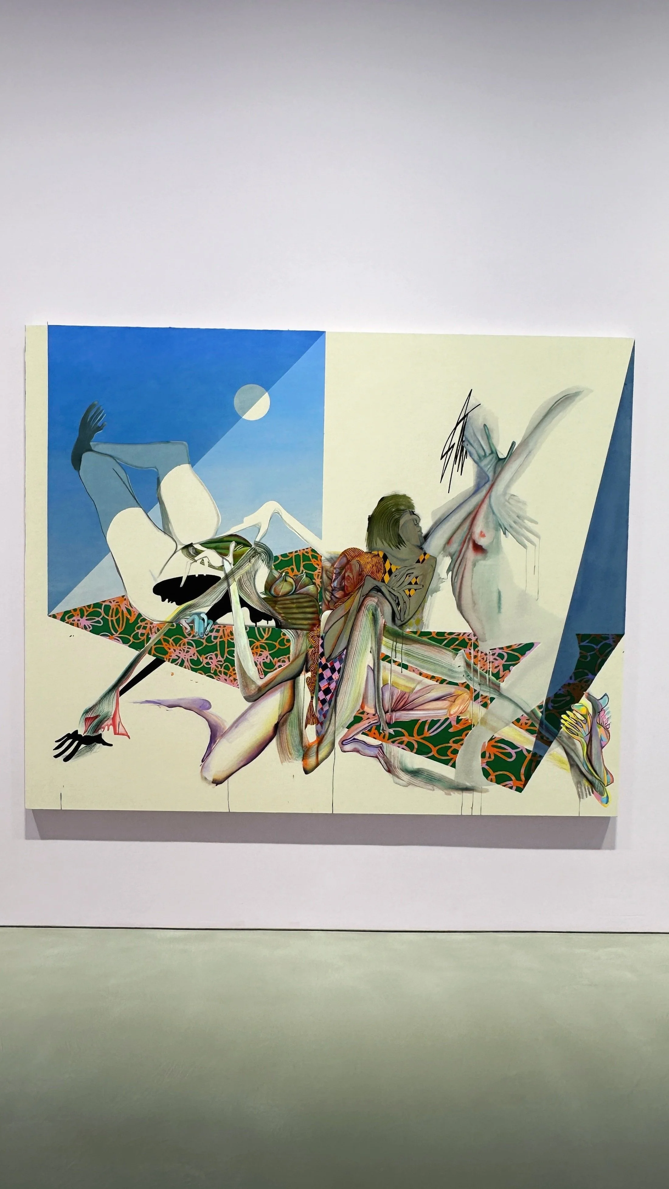
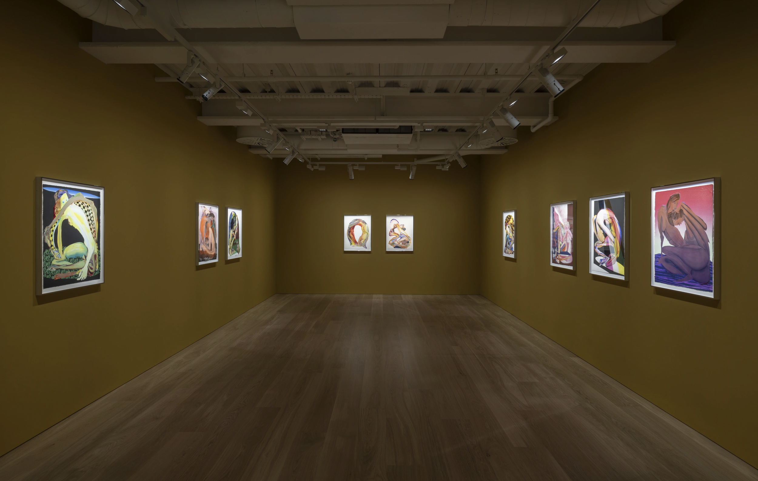
Pilar Corrias - Tripping Over My Joy
Presenting a solo exhibition of Christina Quarles’ new work, the gallery features a body of painting and drawings that delves into notions of identity and representation; synthesising previous studies of drawing, experimental painting techniques and digital technology. The work show examples of incorporating use of different media to form new solutions.
Reflection & Learning Outcomes
•
Reflection & Learning Outcomes •
Endless Variations
The works from Francis Bacon made me rethink again how the basis of visual design- including use of colours, style, and tone, can really affect the overall reception of an artwork. The use of strokes and colour across Bacon’s portraits shows a very deep emotional attachment to what’s been presented. We can easily see the or predict what the portrayed characters are feeling, giving inspiration to how I could’ve approached Brief A in context of its abstract expressionisms.
Meanwhile, the many archival works from Andy Warhol has made me realise how the use of multi-media- using a mixture of newspapers, printed maps & photographs as canvas to paint on. The hand-written and rough feel makes the work a lot more personal, giving voice to a written text which we could also consider in terms of thinking about representations of text & images in future projects.
ON FOOT -
JW Anderson
The JW Anderson curated exhibition has got me in awe in terms of its designed space and how works from different artists are framed and positioned in ways that flows smoothly reflecting the London scene despite different styles and content presented. In fact, I thought that it is this difference in the artists work which shows what Anderson described in his rationale as a place of ever-changing scenes and cultures clashed together in a city they call ‘home’.
The placement of each element is also positioned in unique ways irregular to usual exhibition presentations, for instance installations placed so low near the floor, and some near the ceiling, making spectators actually have to lean forward to take a closer look. This allows the audience to become more immersed into the works presented as they spend more time trying to take a look at each work, allowing us to sit into the artists’ world by making us experience their experience. The exhibition made me reflect how interactivity and the curation itself can also be a medium in translating a message, which is something I never tried working on before.
I was intrigued how Anderson chose to separate a given space by incorporating additional screens to divide the room into sections, rather than purely placing elements on available spaces. Each room presents work of different artists, but yet it seems coherent due to the choice of background graphic and pop colours used on the screens to demonstrate the London art and entertainment scene.
Tripping Over My Joy
The works of Christina Quarles has been really helpful in understanding possible ways of abstracting and deforming a human body for my Brief A project on The Black Square. Despite how abstract the characters are represented, it is still possible for spectators to recognise them through the use of lines and shapes that resemble parts of the human body.
Furthermore, the painting style Quarles incorporates creates a surreal world distinctive to her work, drawing the audience along with her fantastical representations. It was also interesting to see how the artist manages to present traditional painting on canvas in innovating and new ways by incorporating digital technology (light) from the back of the frames. This made me rethink the many possibilities we can present work, and how as art directors it is important to think how ways of presenting is also significant in adding meaning to visual contents.
Read Next
